The Problem
An outdated look and feel that didn't have any sort of identity or personality to reflect their innovative product or stand out in the marketplace.
The Solution
I elevated the brand with a new logo and identity to reflect the modern, tech-driven and innovative services & product they offer.
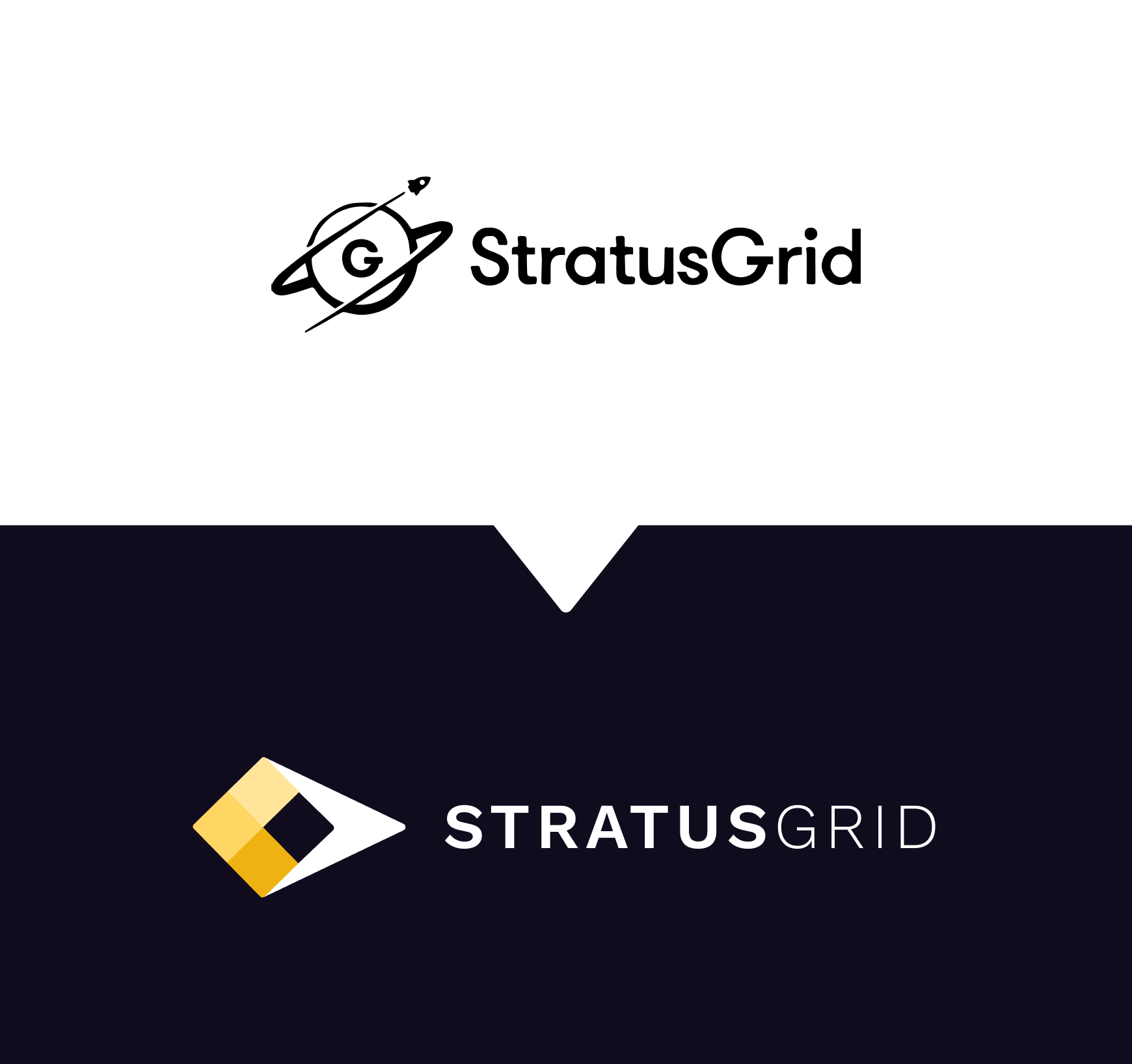
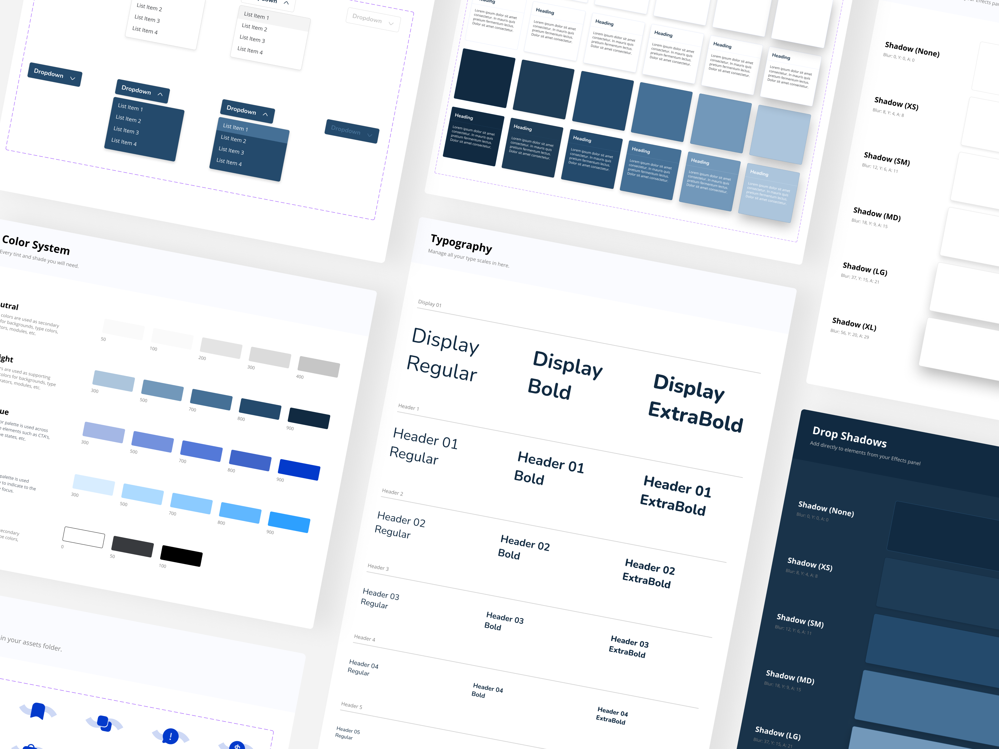
The use of rounded squares as a graphic language is used to relate back to pixels or data, which is at the core of what SG offers for cloud services. The use of squares to create pattern or moveable background shapes gives the brand a dynamic and versatile feel.
The subtle gradient is also used in the brand identity to allude to SG's product, Stratusphere. It gives an airy, modern feel to the brand. It touches upon the space theme associated with the original brand and the notion that clients and SG can work together to achieve the impossible.
