The Problem
The previous brand style didn't communicate who they were as a company and how they wanted to be perceived going forward. There was no consistent graphic language to give the brand personality to allow Sakari to stand out in the marketplace against competitors.
The Solution
I created a brand style that reflected how they wanted to be perceived: playful, powerful, and modern. This brand style really allowed me to experiment with gradients and incorporate them in a strategic way that balanced playfulness with professionalism.

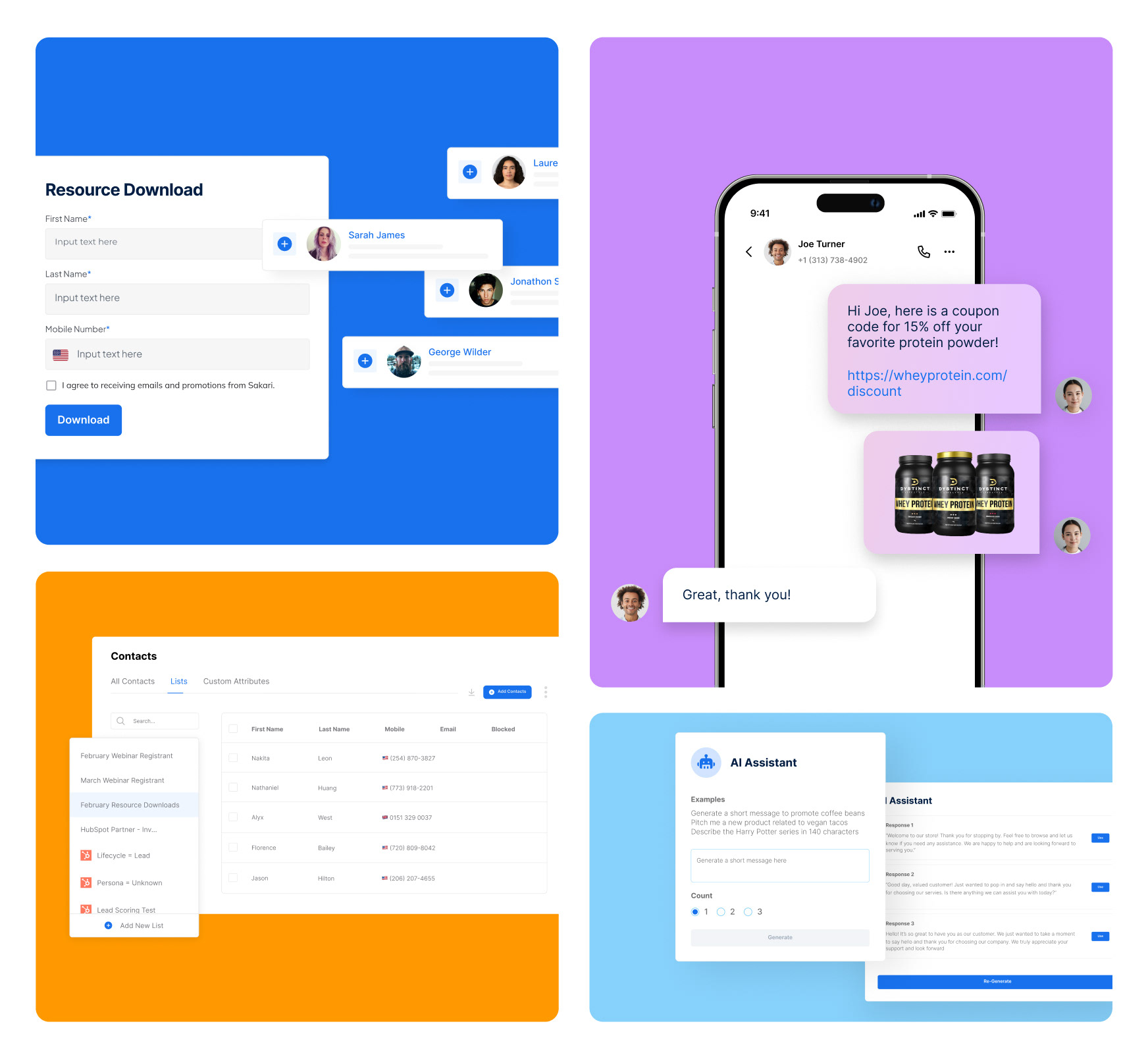
I had a lot of fun experimenting with gradients in a purposeful way to illustrate Sakari as being a playful and approachable brand. I wanted to incorporate the concept of texting and conversation through the use of message blurbs as the background graphics.
While it was challenging to elevate the brand while also taking the product design into account, I think the overall solution showcases a brand and product that meshes well together and feels modern, sophisticated and professional. It captures their brand ethos perfectly, with the ultimate goal of engaging users.
